One of the wonderful things about developing for mobile devices is the ability to utilize their unique controls to make fun and interactive games. Unfortunately this can also be one of the downsides. While computers and consoles have rather standardized input devices, phones and tablets do not offer quite the luxury. Apple keeps a tight control over the production of their products, and it makes it easier for developers to know what the user will experience when using their app. Android on the other hand, for better or worse, involves a wide range of manufacturers which offer different (if any) physical keys. The hardware buttons are “usually” rather standardized amongst Android devices when they do exist, but that is not always the case. Trying to develop appropriate user input controls can be rather frustrating at times for developers, and exceedingly so when trying to develop the same product amongst multiple platforms (iOS and Android for example).
Although it can be a daunting task, the potential for user benefit outweighs the extra effort every time. Mobile app users are less likely to read through instructions, and they shouldn’t have to. Controls should be intuitive and performed without a second thought. If a user doesn’t know how to play your game in under a minute, they’re probably going to quit and never play again. A long time ago an interface designer told me “There should always be at least two methods of input for a user to perform a single action”. He was referring to the use of computer programs and more specifically so to performing tasks with shortcuts or alternatives based upon preference. We still use the same methods, but now as a redundancy when an alternative method may not be available. For example, an Android user may not have a hardware back key on their device, and thus as a redundancy you must offer a back button (or other software means) for them to go back to the previous screen. If they have both options then it is an alternative; if they have only one, then it is a redundancy. While we are not at the need to remove redundancy, we should aspire to give the users more options and more control.
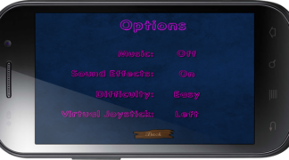
Taking advantage of the input methods on mobile devices can be very powerful and your app users will thank you for it. In my previous developer blog I wrote about my contemplation on whether to incorporate screen-tap commands or a virtual joystick for movement controls in Noms the Fish. Shortly after writing that article I realized that neither alone was a good option. There is no reason to limit the user’s preference on which method they prefer to play the game. In the end I incorporated both methods as a simple option in the options menu for the player to decide how they wanted to play the game. I even went a bit further and gave them the option on whether to place the joystick on the left or the right side of the screen. After all, I want to give them alternatives and not just redundancies. Forgive the virtual joystick graphic, as it is just a placeholder for the final version.
Most experienced app developers will tell you that every hardware key command should also have a software key command (not so applicable to iOS devices). This is very much the case, and the reason is for redundancy. If a physical key does not exist, we have to allow a software version of it so that the user can still achieve the same application function. It should always make sense to the user (they shouldn’t even have to think about it) and ideally it will function the same way. This doesn’t mean that we have to create a software button to perform the same as key commands in every case (although sometimes this is best). When using the aquariums in Noms the Fish, the player has the option to make the aquarium itself full screen. On the PC version the escape key returns to the player to the aquarium management screen as this is a rather obvious choice to the user. On an Android device, there is no escape key and in some cases the physical back button may either be non-existent or not an obvious choice to a casual user. The whole point of the player going full screen with their aquarium is to bask in the awesomeness that is their creation, and thus a software back button in any form would be obtrusive by design. So what would be the most intuitive action for the player to take if they were unsure how to return? They would tap the screen. In this case a simple tap to the screen returns the player to their aquarium management view. This example is rather basic, but it is a good point to show that alternatives are always available to developers and do not need to be complex.
Until the day that voice recognition software can translate profanity into desired effect, we must develop our applications to be as user friendly and intuitive as possible. That is not where we should stop however; we should give the players more options to customize their own controls as much as possible and within the confines of the game’s design. If the design does not allow for it, then perhaps it is time to change the design rather than try and change the user. Keeping in mind that redundancies are flexible by design and that more control should be given to the user when possible, developers can excel at making great mobile applications that engage the user.
OCT


About the Author:
Brian is the Founder and Lead Developer of Alien Octopus Studio. He has a history of game design and reporting that spans almost two decades.